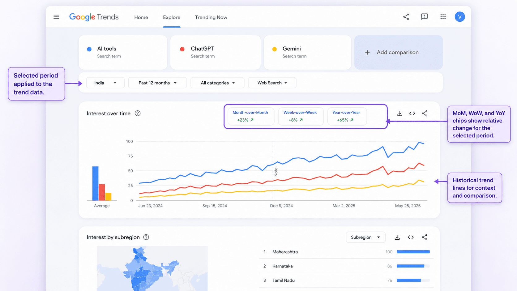
For years, a proper google trends comparison over time meant picking between two annoying options: manually swapping date ranges and squinting at separate charts, or exporting CSVs and building period-over-period math in a spreadsheet. Neither was quick, and neither belonged in the middle of a content planning session. Google just smoothed that out with a quiet but meaningful update.
In July 2026, Google announced on LinkedIn that it was rolling out clickable comparison chips directly above the Trends timeline. Add a term or topic and you will see Month-over-Month (MoM), Week-over-Week (WoW), and Year-over-Year (YoY) right away. Tap one and Trends overlays the matching historical line on the same chart. By the end, you should be able to (1) read what each chip is actually comparing, (2) run a seasonality check before you greenlight a content cluster, (3) tell a real news spike from a repeating pattern, and (4) keep an eye on post-publish demand without leaving Trends.
What Exactly Launched: A First Look at the Google Trends New Feature
This google trends new feature fixes a familiar workflow tax for anyone who plans content off search interest. Before this, comparing this week to last week usually meant opening another tab, resetting the date range, and mentally stitching two charts together. The chips make that comparison native, fast, and hard to mess up.
Once you add a term or topic, three chips show up above the timeline: MoM, WoW, and YoY. Each one prints a percentage change on the chip itself. Click a chip and a second line appears on the same graph for the comparison period; click again and it disappears. Google Search Central announced the feature on LinkedIn, positioning it as a faster way to analyse changes in search interest.
Info: The percentage shown on each chip represents the change in normalized search interest between the selected period and the comparison period. A "+42% MoM" result means the indexed interest measure increased by 42% relative to the preceding period. It does not mean search volume increased by 42%, nor does it necessarily mean the index rose by 42 points.
How to Use the New Google Trends Comparison Feature: 3 Workflows
Clicking the chips is the easy part. The real skill is choosing the right comparison so you do not talk yourself into a bad calendar decision. WoW answers the urgent question: is this accelerating right now? MoM zooms out just enough to show whether the last few weeks are building or fading. YoY is where you go to settle the seasonality argument. The workflows below tie each chip to a decision you will actually make.
| Chip | What It Answers | Best For |
|---|---|---|
| WoW (Week-over-Week) | Is this trend accelerating right now? | Sanity-checking news spikes and reactive content |
| MoM (Month-over-Month) | Is momentum building or fading over recent weeks? | Testing whether a topic lasts beyond a single moment |
| YoY (Year-over-Year) | Does this pattern repeat at the same time every year? | Verifying seasonal keyword research before you commit |
| Use this table to choose the right chip for your content decision. |
Workflow 1: Validate Seasonal Keyword Research Before Committing a Cluster
Say it is early April and your Trends chart for "summer recipes" starts to tilt upward. The instinct is to ship immediately. The better question: are you seeing the start of the usual seasonal ramp, or a short-lived bump from a campaign that disappears by next week?
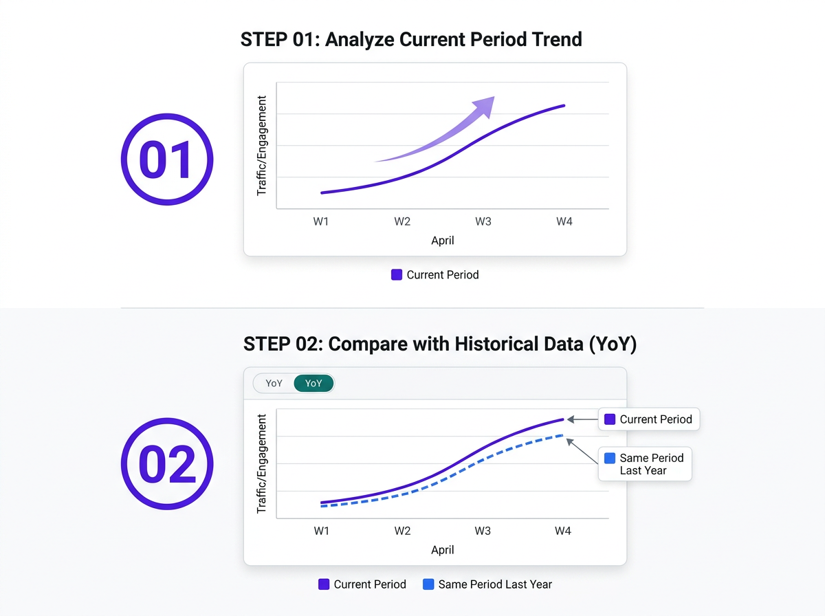
Hit the YoY chip. If last April's line mirrors what you are seeing now, you have a repeatable seasonal pattern, not a one-off blip. That is the kind of confirmation you can budget around: commit the cluster, assign writers, and schedule with some confidence that demand will show up on time. If the lines separate, pause and re-check in a week before you staff it up. That discipline keeps an editorial calendar tied to search-interest reality instead of vibes. For a broader framework on where this fits into your research process, see improve search ranking: keyword research to execution.
Workflow 2: Gut-Check a News Spike (Real Trend or Annual Blip?)
A topic lights up in your monitoring dashboard and suddenly the room wants a reactive post by tomorrow. Before you lock it in, run a quick two-chip check and then confirm with YoY.
Start with WoW. A big positive percentage means interest really did accelerate this week. Next, flip to MoM. When month over month search trends are also strong, the spike has some runway instead of being a one-day blip. Then overlay YoY. If you see the same spike at the same point last year, you are probably looking at a predictable calendar event ("tax deadline" in April), not a breakout. Chasing recurring events can fill a gap, but it rarely earns the links or shares that true breakout coverage tends to attract. If you want a wider filter for what is genuinely new versus cyclically recurring, review the top 5 AI marketing trends for 2026.
Tip: Google Trends flags queries growing faster than 5,000% as 'Breakout.' If you see that label alongside a strong WoW chip and no matching YoY spike, that combination is a strong signal the topic is genuinely new territory worth covering.
Workflow 3: Track Post-Publish Demand and Content Decay
Most teams treat Trends as a pre-publish tool: pick topics, place bets, move on. The chips are just as useful after a page is live, when you are deciding whether to refresh, expand, or let something age out.
After you publish a piece aimed at a specific topic, check Trends monthly and click the MoM chip. If relative interest is flat or rising, you are still in a healthy demand window. If MoM goes negative two months in a row, treat it as an early warning and refresh before organic traffic starts to slide. Use YoY to see whether a once-reliable evergreen topic is losing its seasonal lift year over year. If something peaked at 85 last July but only hits 60 this July, the demand curve is shrinking, and an update may not bring it back. This kind of ongoing trend analysis for content you have already published is covered in the quarterly format at AEO trends to watch from April to June 2026.
A Critical Reminder: Normalized Interest Is Not Search Volume
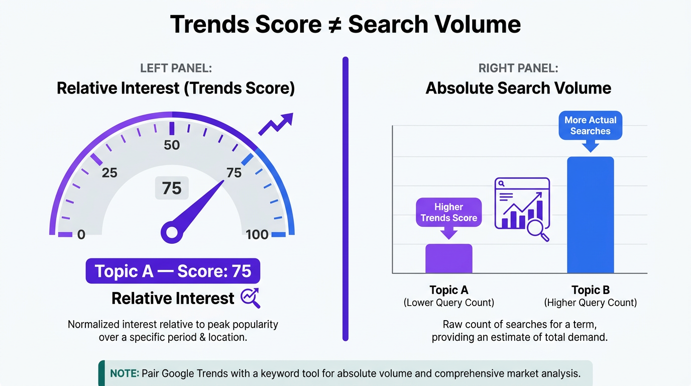
Google Trends uses a normalized 0–100 index. A score of 100 represents the point of highest relative popularity within the selected search, location and timeframe. A score of 50 means the normalized value is half the chart's peak value. It does not mean the term received half as many searches in absolute numbers.
The chips follow the same rules. A "+30% YoY" reading tells you relative interest rose, but it cannot tell you whether that is 500 extra searches or 500,000. When you need absolute volume, pair Trends with a keyword tool like Google Ads Keyword Planner. Trends gives you direction and shape; keyword tools give you scale. Put them together and you get the full picture. For pairing search-interest signals with AI-driven demand, see prompt research for AI search.
If you are building a broader visibility strategy beyond one-off keyword checks, AI search visibility management tools breaks down the platforms worth evaluating alongside Trends. If you are also tracking how Google's own surfaces are shifting, Google's AI search labels is worth skimming before the next planning meeting.
Faster Insights, Smarter Strategy
The comparison chips do not change what Google Trends measures; they change the time it takes to get to an answer. What used to mean exporting a CSV and building a pivot table is now a single click on the chart you are already looking at. If your team runs google trends comparison over time checks as a standard planning step, that speed adds up across a quarter of decisions.
The highest-leverage uses are straightforward: confirm seasonality before you spend, separate real breakouts from predictable annual patterns, and monitor demand after publish before decay becomes a traffic problem. Run those checks consistently and content bets get easier to defend because the inputs are visible. For how trend data plugs into a complete 2026 SEO plan, the AI search visibility optimization 2026 playbook is the next stop. Vizup's analytics tools can help you track how those bets perform once the content is live.
Frequently Asked Questions
What do MoM, WoW, and YoY mean in Google Trends?
MoM (Month-over-Month) compares this month's normalized interest score with the previous month. WoW (Week-over-Week) compares this week with the prior week. YoY (Year-over-Year) compares the current period with the same period 12 months earlier. Each chip shows the percentage change and, when clicked, overlays the comparison period as a second line on the chart.
How is Google Trends data different from keyword tool search volume?
Google Trends reports relative interest on a normalized 0-to-100 index, where 100 is the peak within the timeframe you choose. It does not provide absolute query counts. Keyword tools like Google Ads Keyword Planner estimate monthly search volume. Use Trends for direction and seasonality, then use a keyword tool to size the opportunity.
Can I use the Google Trends comparison over time for local SEO?
Yes. Google Trends supports filters for country, region, metro area, and city. Set the geography first, then click MoM, WoW, or YoY; the comparison line and percentages will reflect interest in that location. That makes the chips handy for local content calendars and regional campaign timing.
Is the year-over-year Google Trends comparison accurate for new topics?
Not reliably. If a topic does not have a full 12 months of history, the YoY chip may show no data or create a shaky comparison because there is no matching prior-year window. For newer topics, lean on WoW and MoM, then revisit YoY once a full year of data exists.
How can I use this new feature for B2B marketing?
B2B teams can use MoM to see whether interest in a product category or technology is building ahead of a campaign. YoY is useful for confirming whether industry rhythms (annual conferences, budget cycles) consistently create search spikes, which can guide timing for gated content, webinars, and paid pushes. Pairing this with prompt research for AI search adds buyer-intent context that trend lines alone cannot supply.
